Form Styling Pro
Customize the appearance of your forms to match your website's design — no CSS knowledge required.
Accessing Style Settings
Select the Form Container block in the editor. In the right sidebar, open the Style tab to access all visual customization options.
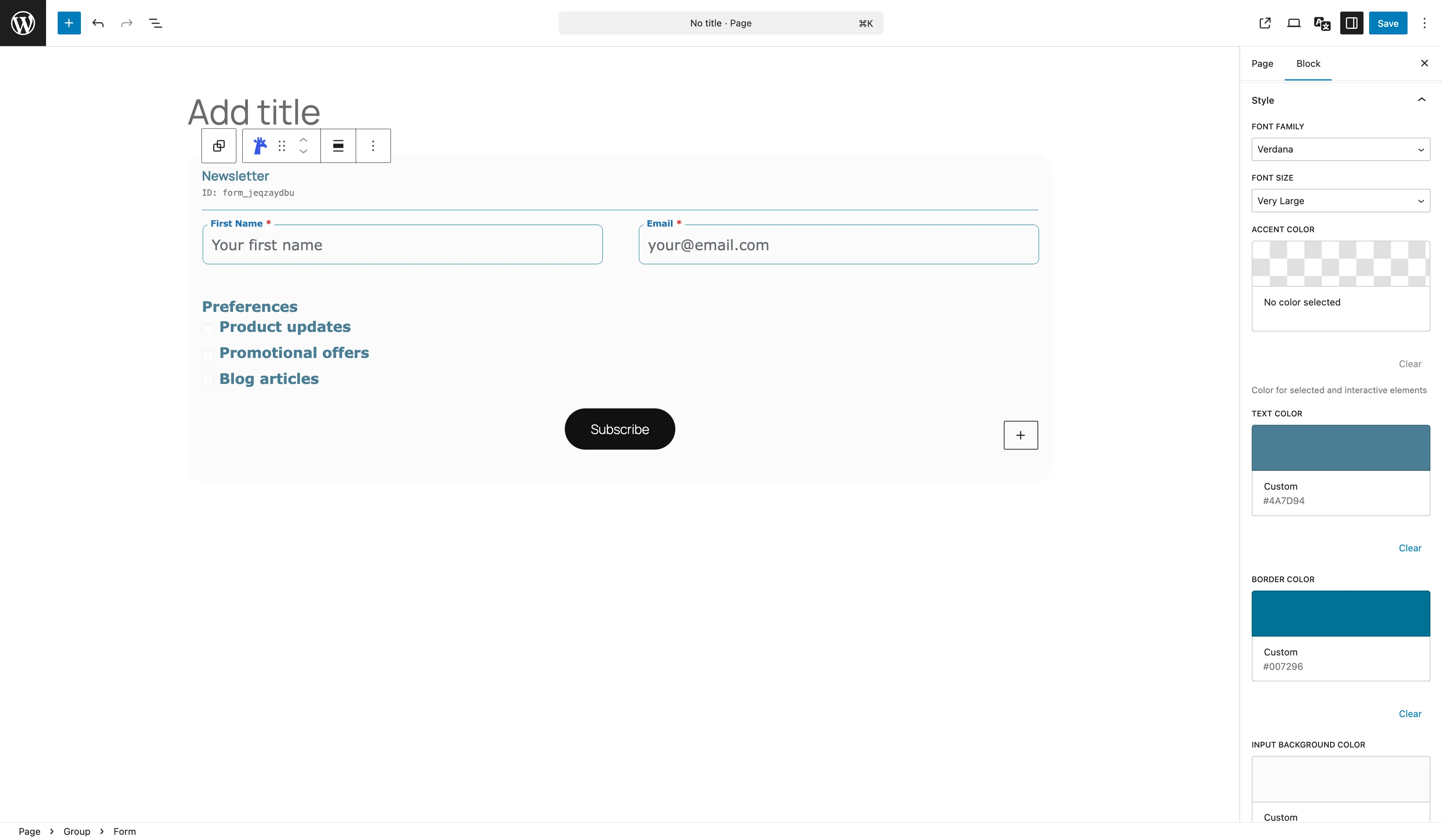
Colors
Control the color scheme of your forms using the color pickers in the style panel:
| Setting | What It Controls |
|---|---|
| Accent Color | Color for selected and interactive elements (focus rings, checked states) |
| Text Color | General text color for labels and input text |
| Border Color | Color of input field borders |
| Input Background Color | Background color of input fields |
Typography
Adjust font settings for your form:
- Font Family — choose from a list of fonts: Arial, Helvetica, Times New Roman, Georgia, Verdana, Courier New, Roboto, Open Sans, Lato, Montserrat, or use the default
- Font Size — select Small (14px), Normal (16px), Large (18px), or Very Large (20px)
Border Radius
Control the corner roundness of input fields. Choose from five presets:
- 0px — sharp corners
- 4px — subtle rounding
- 8px — moderate rounding (default)
- 12px — rounded
- 20px — pill-shaped
Label Position
Choose where labels appear relative to their fields:
| Position | Description |
|---|---|
| Above Input | Label displayed above the field (default) |
| Floating | Label inside the field, animates up on focus |
Submit Button
The submit button text can be customized in the Form Container block settings. Use a label that matches your form's purpose (e.g., "Send Message", "Book Now", "Register").
Custom CSS Classes
For advanced customization, add custom CSS classes to individual fields or the form container:
Add a Class
Select a field block and enter a class name in the Additional CSS Class field under the Advanced tab.
Write Your CSS
Add custom CSS via your theme's Customizer (Appearance → Customize → Additional CSS) or a custom CSS plugin.
Unlock Form Styling
Custom colors, fonts, borders, label positions and more are available with Giraforms Pro.
Get Giraforms Pro