Form Fields
Giraforms includes 18 field types in the free version. Each field is a Gutenberg block you can drag into your form.
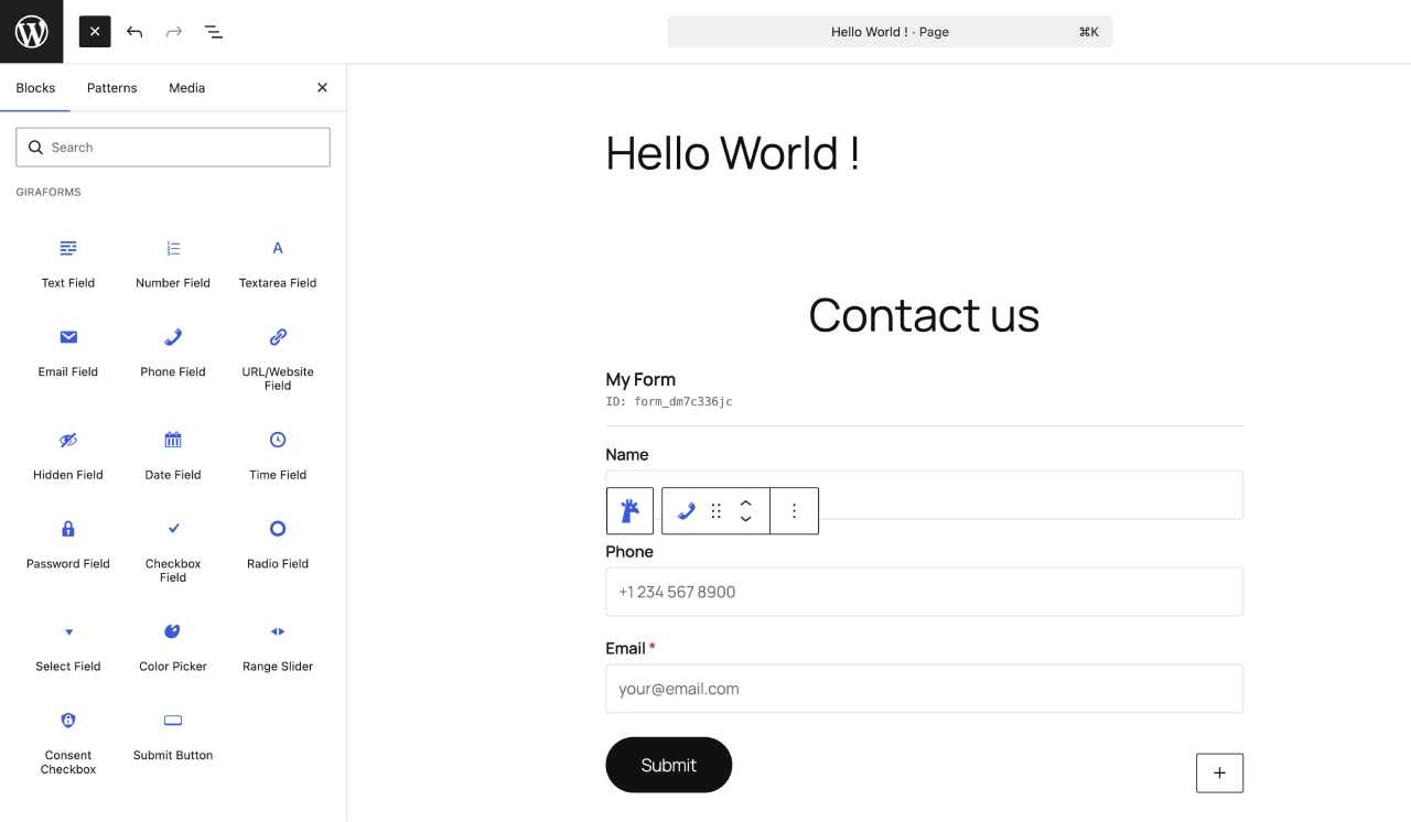
The Giraforms block inserter showing all available field types
Text Input Fields
Text
A single-line text input for names, titles, or any short text. Supports placeholder text, default value, min/max length, and required validation.
An email input with built-in format validation. The browser enforces a valid email pattern, and Giraforms validates server-side as well.
Textarea
A multi-line text area for longer messages, comments, or descriptions. Configurable rows, placeholder, and character limits.
Number
A numeric input with optional min, max, and step values. Useful for quantities, ages, or any numerical data.
Phone
A telephone input field. Accepts any phone number format. For advanced phone validation with country codes, see Premium Fields.
URL
A URL input that validates web addresses. Ensures users provide properly formatted links.
Password
A password input that masks user input. Useful for registration forms or access-controlled submissions.
Hidden
An invisible field that stores a predefined value. Use it to pass metadata like page URL, referrer, or custom tracking data alongside submissions.
Choice Fields
Select (Dropdown)
A dropdown menu for selecting one option from a list. Add options in the block settings. Supports a default selection and placeholder text.
Checkbox
One or more checkboxes for multi-select choices. Each option can be checked independently. Useful for "select all that apply" questions.
Radio
Radio buttons for single-choice selection from a list. Only one option can be selected at a time. Great for yes/no or multiple-choice questions.
Consent
A dedicated consent checkbox for GDPR compliance, terms of service, or privacy policy agreement. Displays a customizable label with optional link.
Date & Time Fields
Date
A date picker that lets users select a date. Uses the browser's native date input for a consistent, accessible experience.
Time
A time picker for selecting hours and minutes. Uses the browser's native time input.
Special Fields
Color
A color picker input that lets users choose a color. Returns a hex value (e.g., #3859ea). Useful for design preference forms.
Range (Slider)
A slider input for selecting a value within a range. Configure min, max, and step values. Displays the current value as the user slides.
Security Fields
Captcha (Turnstile, reCAPTCHA, hCaptcha)
Embed CAPTCHA protection directly into your form. Choose Cloudflare Turnstile, Google reCAPTCHA v2, Google reCAPTCHA v3, or hCaptcha in the block settings. Configure keys in Forms → Integrations.
Common Field Settings
All fields share these settings in the block inspector (right sidebar):
| Setting | Description |
|---|---|
| Label | The visible label displayed above the field |
| Placeholder | Hint text shown inside the field when empty |
| Required | Toggle to make the field mandatory |
| Help Text | Help text shown below the field |
| Advanced | Add custom CSS classes for styling |
text_abc123). The label you set is used in form display, submissions, and email notifications. Use clear, descriptive labels (e.g., "First Name", "Company Email") as they appear in submissions and email merge tags.
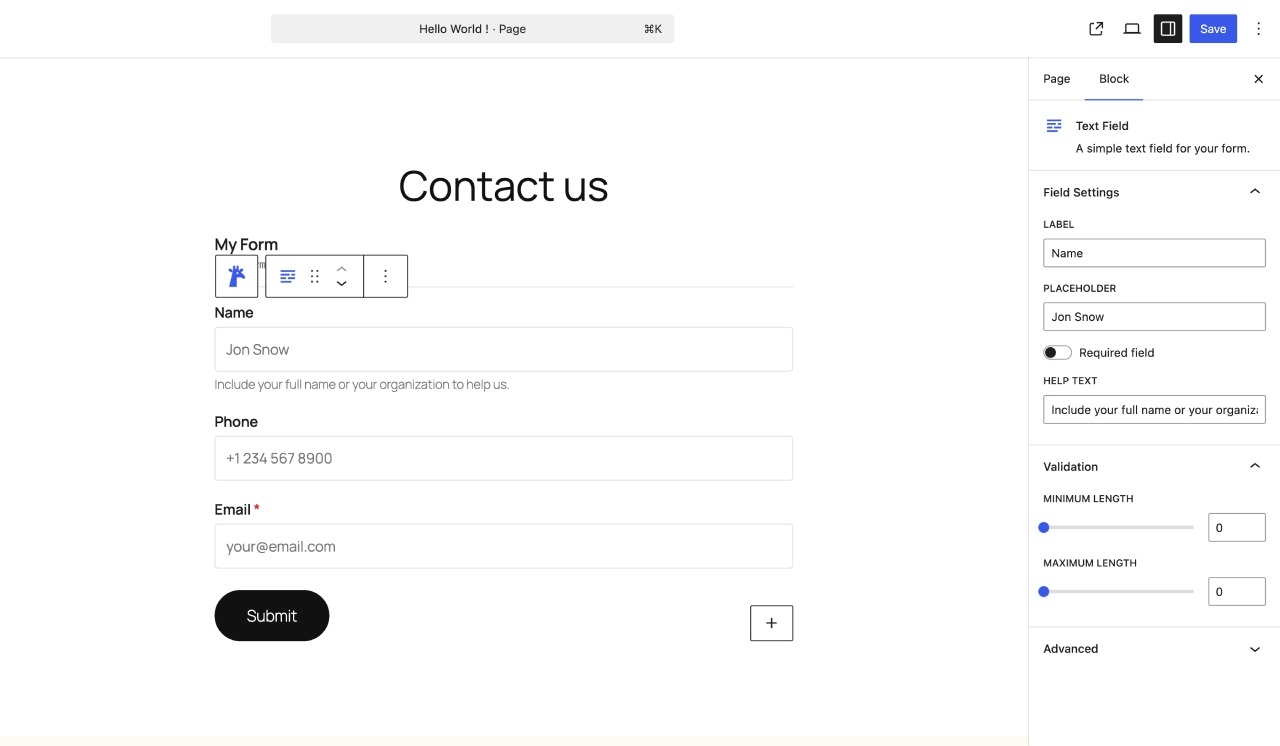
Common field settings in the block inspector sidebar
Looking for more advanced field types? Check out Premium Fields for file uploads, signatures, ratings, and more.
Need more field types?
Upgrade to Giraforms Pro for 9 additional fields: file upload, signature, currency, Stripe payment, booking, and more.
Discover Giraforms Pro